If you’re anything like me, you spend a lot of time putting together research decks. Despite the naysayers who shun anything related to slide decks, they’re often the most practical way to convey your ideas. As long as they’re done well – a task that’s easier said than done.
For charting, the default Powerpoint options aren’t great and are usually full of chart junk, but they do allow pretty full customization. Contrast that with Keynote, which offers great defaults but is much harder to tweak to your liking. But even without the full customization power, I nearly always find myself gravitating toward Keynote. And now that I figured out this new graphing hack, I have one less reason to consider booting up Powerpoint.
Highlighting a Single Data Point
Everyone who works with data visualization has their bag of tricks. There’s one that I often find myself reaching for that I used to think was out of play for Keynote: Highlighting a single data point. It’s great for calling attention to a particular detail, or when showing a series of related charts and highlighting the common variables amongst the series.

The above screenshot is taken from an actual report I’m working on. Details were obscured for privacy, but you can still see the aim of the slide. I have three different datasets, with three different graphs, but a common and consistent theme between them. Highlighting the individual data points on each graph is a very powerful way to convey, at a glance, the commonality between them.
Walking Through an Example
Let’s walk through the steps to create a graph like this with an example. Imagine you’re comparing conversion rates across segments. By default, just dumping your data into a bar chart will create something like this:
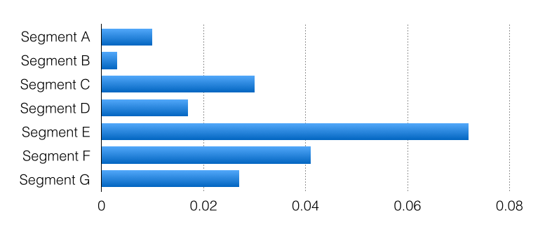
As I mentioned, the defaults are actually pretty good. It wouldn’t take much to make this a perfectly acceptable chart. Update the axis labels and remove the gradients and you’re 80% of the way there:
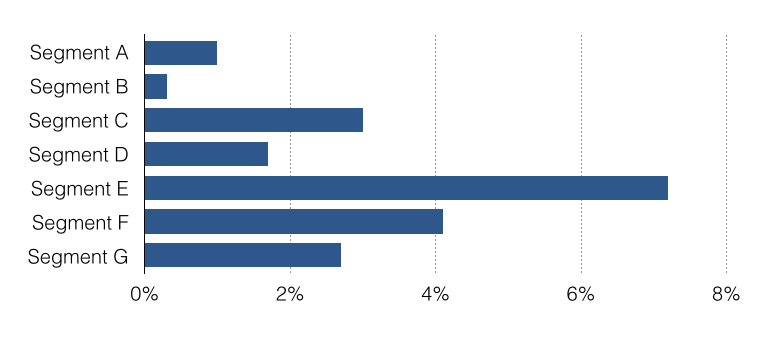
Honestly, there’d be many cases where I’d stop there. It’s pretty clear and pleasing to the eye. But there are plenty of cases where you’re trying to tell a particular story, not just with this graph but as part of the overall presentation. And in these cases, it’s helpful to spend a few more minutes really crafting the visualization. So let’s start with a simple rearrangement:
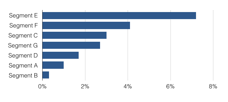
We’ve sorted the data by conversion rate to prevent the eye from jumping around and make comparisons easier. (As an aside, this sorting is actually a little counterintuive in my example, since I’m using the alphabet for my segments. You usually expect the alphabet to be shown in its proper order, but you’ll rarely have this type of confusion in the real world since segments are rarely ordinal.)
Two last adjustments. First I’m just going to add data labels directly to the bars, and since the data is now listed explicitly, I can remove the x-axis entirely.1
The last adjustment I want to make is to highlight an individual data point. Up until now we were using the standard Keynote controls. For this, though, we have to resort to a little bit of a hack. We’re going to create a fake data series, with just the data we’d like to highlight, so we can style it differently than the main series. Let me show you what I mean.
When you click the “Edit Data” button, your data should be in a single row or column. Now simply take the piece you want highlighted, and simply shift it to it’s own row.

You can see in the screenshot above, we’ve simply moved the Segment E data down to it’s own row, even though it belongs to the same data series as the rest. That will give us the styling control over that single data point which we were seeking, and gives us something like this:
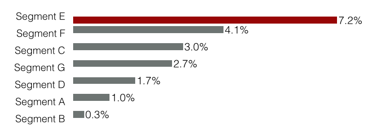
You’ll notice we’re not quite there yet. The spacing appears off since Keynote is actually trying to render two sets for each segment - the red and the grey bars - but we don’t actually have data to show for both sets. So the last adjustment is just toying with the percentage gaps between bars and between sets. I set a 0% gap between bars, and a very wide gap between sets.
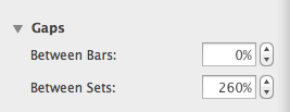
That gives us something we can be happy with. It’s still not perfectly aligned - like I said, this is a hack - but for most uses it will go unnoticed.
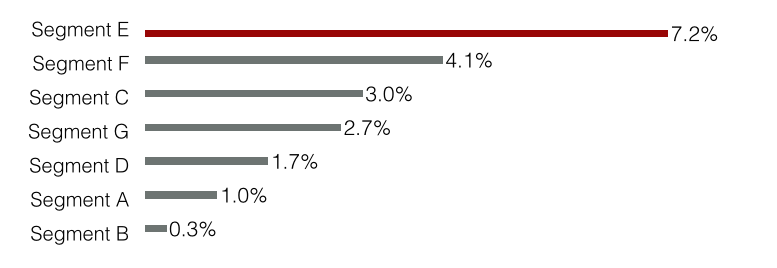
Lastly you can bold the series for additional emphasis.

Now I can’t pretend that this is a great solution. The alignment is off, it’s a pain to get there, and you still don’t have complete control over colors. But pragmatism usually wins, and it’s an 80% solution that I was honestly pretty excited to discover.
What do you think? Share your thoughts in the comments.
-
Many people with hard science and mathematics backgrounds will argue against removing axis labels. In certain contexts I completely agree. But story-telling – which is really our job as business leaders – is not one of those contexts. If you’re not misleading intentionally, and you’re presenting accurate information, you aren’t required to comply with education and research standards. ↩
