At a really simplified level, an analyst is responsible for taking a pile of data and come back with a handful of insights to report. Data in, insights out. If you’re not familiar with the process, it may be easy to assume they knew from the beginning those few key numbers that they wanted to report, and simply ran some calculations to get them.
But it’s not always that easy. Honestly, it never is. When you’re dealing with real world data sets, you don’t know what’s interesting until you’re knee deep in the data. To get there, you have to just start exploring.
Simple Scatterplots
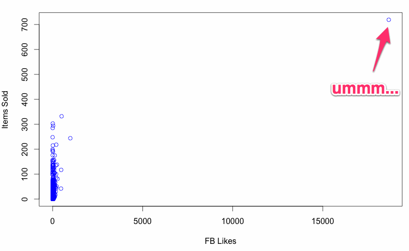
My first step is almost always a simple scatterplot across a few dimensions. This will give you a better understanding of the overall shape of your data, and help you uncover any holes or extreme outliers. With outliers easy to pick out, it’s often helpful to take what was just a number and go back to the source to tease out the story. Some analytics tools, for instance, will let you to take a session id and see the entire clickstream to see what really happened with that outlier that somehow purchased eight times but never saw a receipt page.

Correlegrams
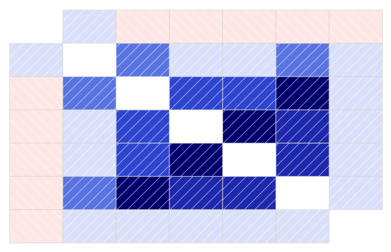
Correlegrams are another great tool for exploration. A correlegram will simply plot the correlations across all dimensions of your data set, so at a glance you’ll be able to see what factors seem to be related and to what degree. Couldn’t be easier with the corrgram package in R:
> library("corrgram")
> dataset <- read.delim("TAB_DELIMITED_FILE_HERE")
> corrgram(dataset)
I’m not exaggerating – it’s a three line copy/paste to get a correlegram that will look something like this:

The darker shades indicate a strong correlation, and blue indicates a positive correlation whereas red indicates a negative one. I scrubbed the variable names that would be in the white squares, but it’s easy to see how useful this three liner in R can quickly get you on an exploratory path.
The Workhorse – Pivot Tables
Pivot tables are another great tool if you’re not willing or able to fire up R. You can slice and dice and find patterns with a simple GUI. Similar to corregrams, you can use conditional formatting to see how the variables interplay at a glance.

A Quick Note on Process
I find it easiest to take notes on paper while I go through this process. It helps because I quickly jot down my thoughts and let my mind wander from point to point. It’s easy to get lost in a trail – you’ll find an interesting pattern, make a guess about the meaning and then start slicing other ways to check your assumptions, on and on down the line until you’re 6 steps removed from the original pattern. Those trails are often the most productive, so by keeping my notes light I can retrace my steps without taking myself out of the moment.
It may seem like wasted work, as you’ll often end up re-running reports that you had already seen during exploration. But despite the roots in hard sciences, analysis is often a creative endeavor. Your mind needs space to think creatively without feeling weighed down by documenting every step of your exploration process.
