Graphing data is surprisingly difficult. It’s easy to dump data into Excel and create a basic chart. That’s not difficult, and that’s what you’ll see from most people - even seasoned analyts who know how to crunch numbers.
But the art of effectively communicating through data visualization is a valuable skill on its own right. And I don’t just mean complex, interactive visualizations or giant infographics. Simple graphing also falls under the umbrella of data visualization, and most people don’t give it the respect it deserves.
With that said, I want to dissect a chart I came across tonight. The data comes from the AAUP and hat tip to Yoni Appelbaum for bringing it to my attention.
Here’s the chart:
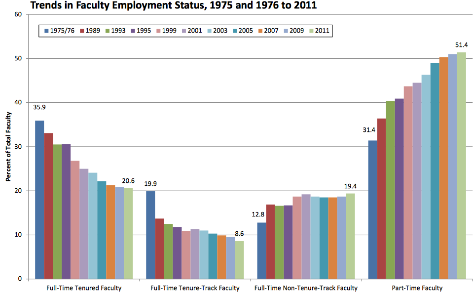
It tells an interesting story, but it’s a little difficult to parse at first. I don’t say this to disparage the chart itself, or the author. It’s honestly not that bad, and it’s clear that the author was trying to include some exact and precise data points that likely made sense in the academic and research context.
But It Could Be Better
My problem with this chart is simple. It contains 4 data series plotted across time, but doesn’t use the x-axis to label the time series. For time-series data, the x-axis is almost always used to display the time, and this graph bucks conventions.
The most obvious fix is to use small multiples. We’ll use the same bar-chart format, but simply update the labeling a bit.
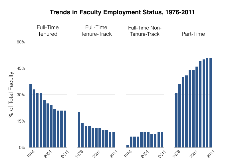
This is much easier to digest.
As always though, there are trade-offs. The biggest is that you’re losing the time-series specificty. This small multiples example implies a continous trend, and the actual gap years aren’t shown. The other missing element is the beginning and end date value labels directly on the chart. That’s useful context, but ultimately I think the trends are most important than the direct numbers.
I’d argue these trade-offs are worth it, but is this the absolute best way to display the data? What if we use a simple line chart?
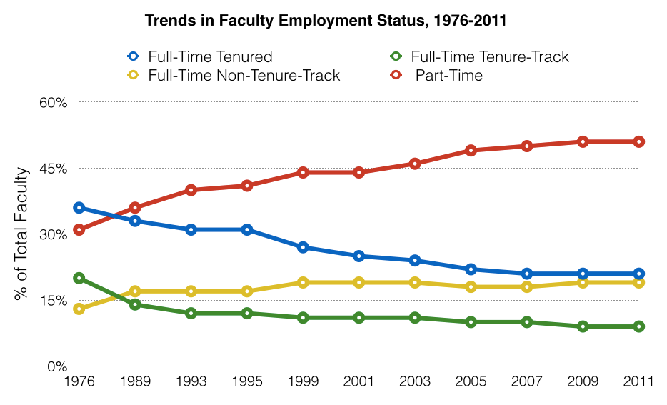
Not bad. It does a better job of showing the points in time where the trendlines actually intersect, without any signficant fidelity tradeoffs compared to the small multiples example.
Are we there yet? When you have a distribution time-series data like this, it’s often shown as a stacked bar instead.
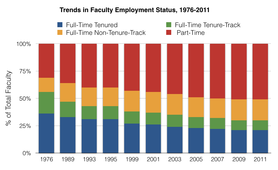
This could work too, but after seeing it I actually think the line graph is better. That’s one of the difficult parts of data visualization - you may need to try multiple graph types before choosing the best option.
But We’re Still Missing Something
While the above options are all valid ways to show the distribution of jobs over time, it’s missing a crucial piece about the overall market. Is it growing or declining?
You can’t tell anything about the overall market size by only looking at job share - you need the absolute numbers. So here’s what the absolute numbers look like.
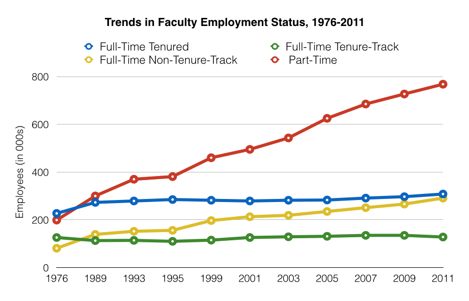
As you can see, the industry is still growing. It’s just that the growth is coming almost entirely from part-time faculty. The coveted full-time jobs have flatlined and have been that way for decades.
Again this might be better shown as a stacked area chart to explictly, rather than implictly, show the overall market size.
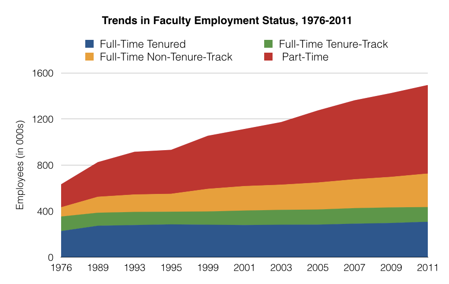
Now we’re talking. We have overall market size, individual job-type size, and implied distributions all in one single chart. But we’re still missing something.
One Last Change
There is still one major issue with this chart. The display implies a continuous time series, even though there are significant gaps between the years. While they are explicitly labeled, it’s still skewing the overall visualization.
Since there are large gaps between the 70s and 80s, the rate of change is being compressed in the early years. Let’s extrapolate those missing years to see a more accurate picture.
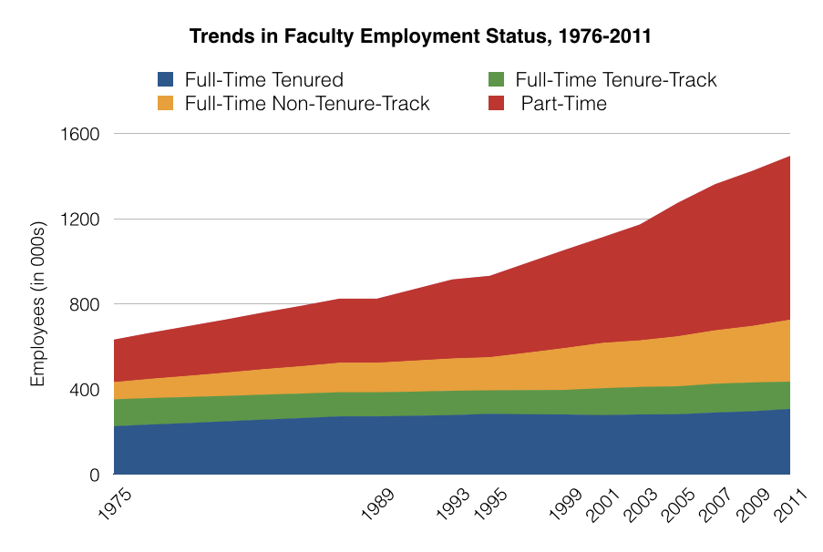
This adds some crucial context. While the low-end jobs were growing throughout the 70s and 80s, it wasn’t until the past decade or so that the growth has really exploded. I’ll let you draw your own conclusions about what this really means for higher education, but I believe this graph does the best job of conveying the overall market changes in faculty employment.
What do you think? Which graph tells the story the best? Am I missing another option that would do a better job? Let us know in the comments.
